Mobile Identity IQ
UX Case Study
Summary
What is this product?
IdentityIQ is an Identity and Access Management product developed by SailPoint.
What problems did we solve?
- Made the workflow responsive
- Reduced time on task
- Improved navigation and way-finding
What challenges did we face?
- Lack of quantitative data and usage analytics
- Product used across wide range of environments
Overview
For this project I focused on the Manage Access flow in the IdentityIQ product. My task was to improve the mobile user experience since the initial version did not consider mobile use cases. Success criteria was defined as decreasing the time on task and improving the overall experience.
Challenges
Improving Navigation
To make the experience manageable we decided to break down the flow into 3 major steps. Selecting users, managing access and reviewing selections. To provide users with way-finding within this flow we realized we needed a better nav bar. Our initial concept was to create a sense of progression and require users to make selections before making the next phase available.
My first concept failed!

This design didn’t test well initially. 75% of the users expressed that the requirement to make selections before progressing bogged down their workflow. Especially in cases where they wanted to toggle between sections before making decisions.
Next Iteration

After reviewing the feedback we received from both users and stakeholders, I revised the nav. I also shifted the nav items into blocks and placed an indicator on each one. However, after another round of testing and internal reviews, we learned that it was confusing as to when the next step became available. The color transition between disabled and active was not visually strong and wasn’t a good cue.
Validated solution

Our final design was a much simpler solution that tested well with our users. Over 90% of users tested expressed that the nav made it clear what step they were on and what was next.
Cards
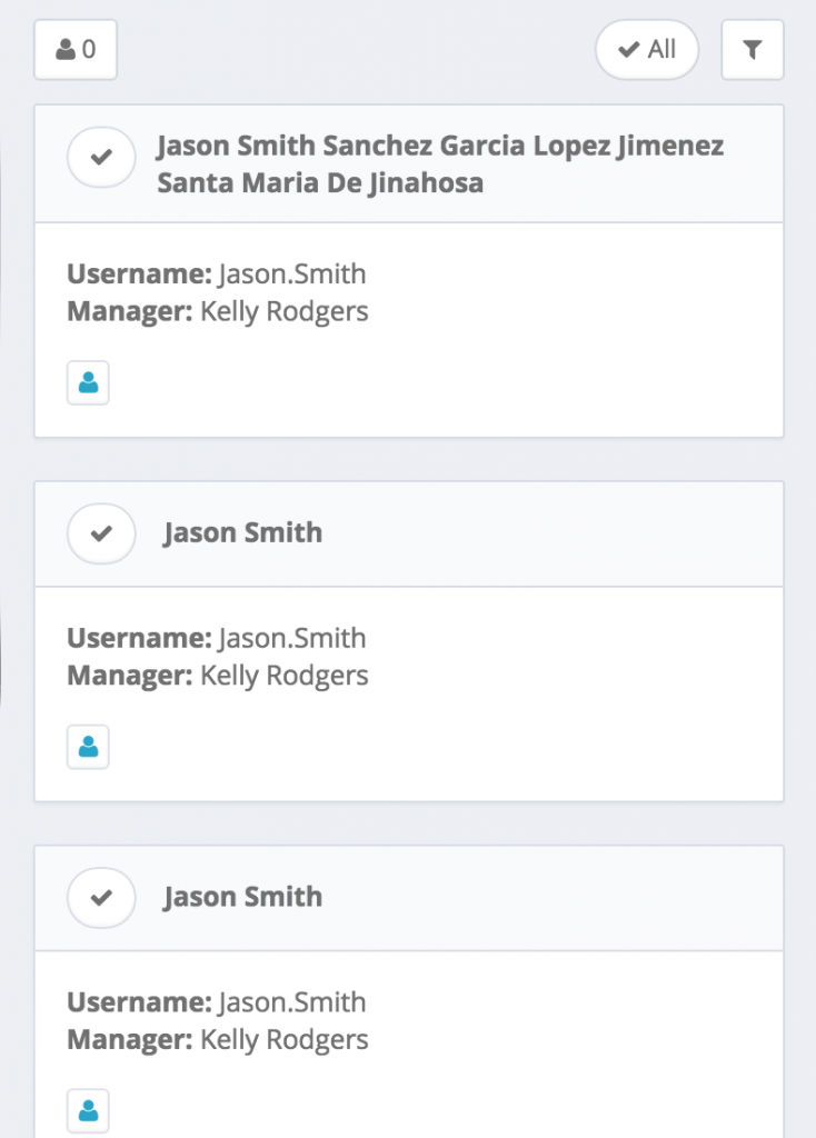
For our card designs we conducted user surveys to uncover what data points our customers needed to make a decision. We discovered the most common ones were username, display name, and manager. In some cases the username and display name could be quite different, so displaying both would provide a fallback.
Identity Card

Role Card
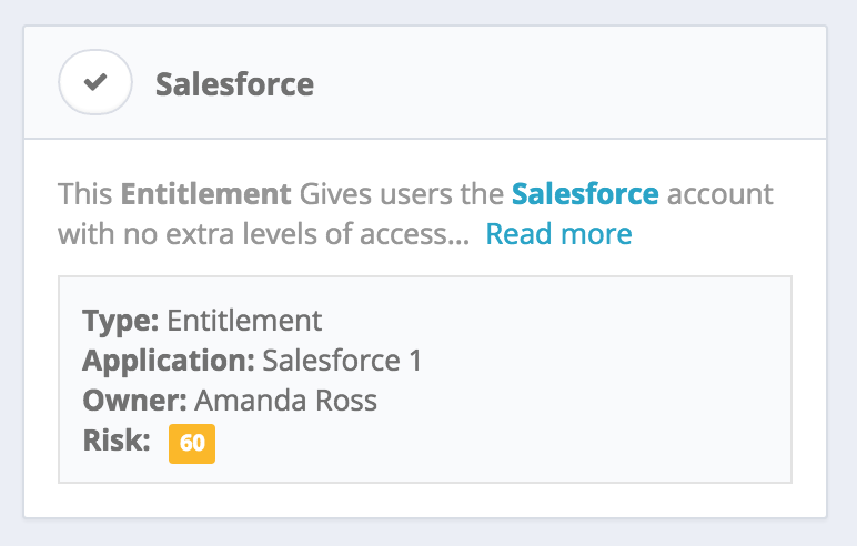
These cards tested well with over half of the users. However in the follow up surveys we noticed feedback on the amount of result on the page. Most customers wanted to see more results rather than more data.
Rich Data vs. Simple UI
We were conflicted between wanting to provide rich info and making this process quick for our users. Ultimately we decided our mobile experience should be an extension of their workflow not the end all solution. The common user journey would have them using the mobile version outside their office to make quick requests or set one up before they got in. Cluttering the UI with data slowed them down and would make the mobile version useless in their opinion.
List Page – Initial concept
List Page – Validated Design
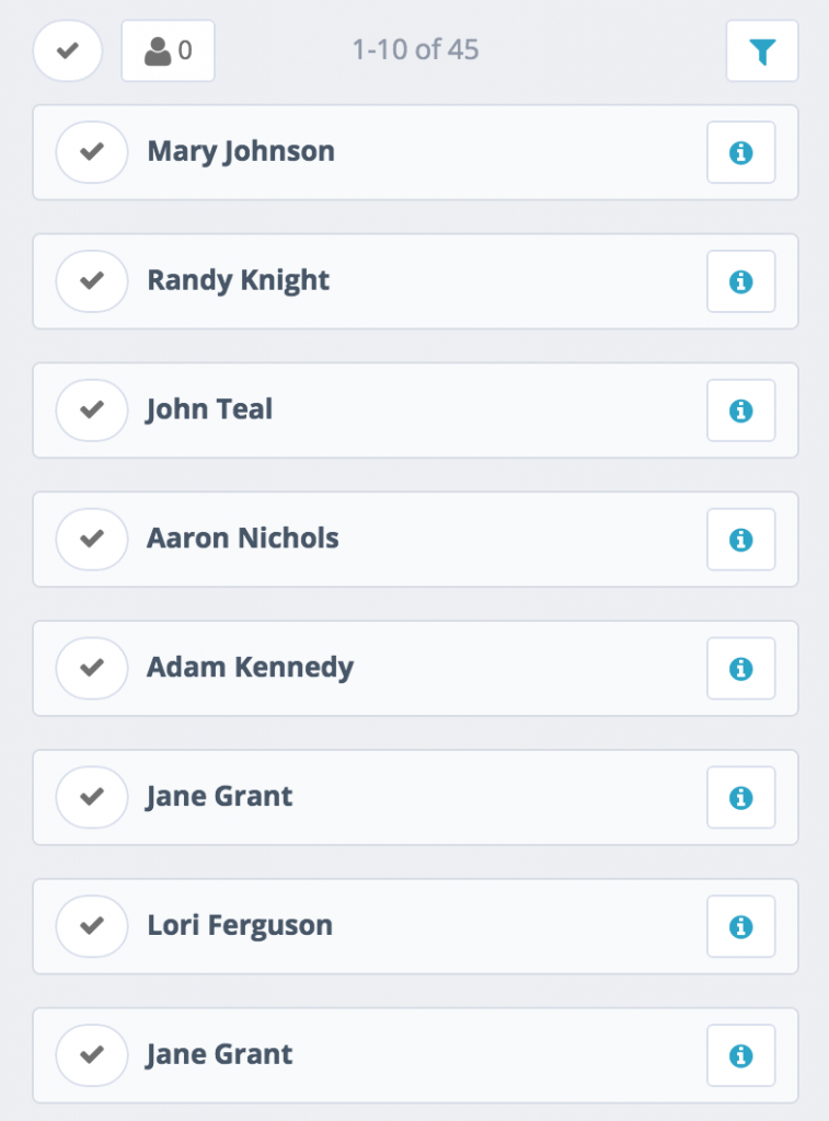
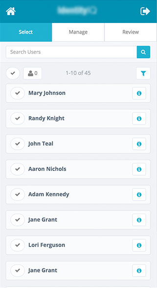
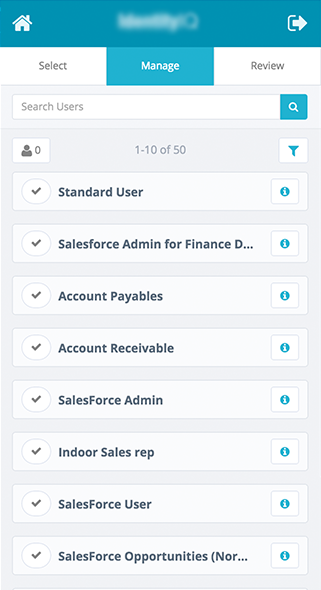
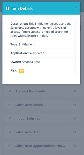
As you can see we now have more results on the screen with the details of each card tucked away until they’re needed. When we tested these versions the users expressed how much easier the UI was to use and how quickly they were able to make requests.
Shipped Product
With this release we wanted to make the experience for managing access for identities smooth, easy, and fully functional.
Selecting Users
Selecting Roles/Entitlements
Modal
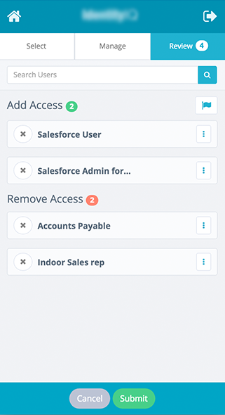
Review Page
